So the semester is over.
I feel good but also feel empty now. I mean I have nothing to do beside taking care of my son( which is also meanignful to me, so that's okay.)
But I wanna keep learning and improve my skills to become a better graphic designer till the new semester will start!
So I will give myself some homework for this brake, break,...blake.....,(?) okay, I 'll look up the dictionary.
okay, that was "break".
anyway, here is the list of what to do during this break.
1. I will make an type animation with after effect.( After Effect)
2. I will make my website.( dream weaver)
3. Start learning about Flash.
That's it so far.
Hope I can accomplish all of them. Wish me luck.
12/12/2007
12/05/2007
type animation final
Here's my final solution for the animation! I really enjoyed learning new things! I will learn more during the break!
12/04/2007
MY FIRST TYPE-ANIMATION!
I still need to edit little things, but I put it on youtube for preview!
In this animation, I made "Charlie Brown" with letters. Can you find him?
In this animation, I made "Charlie Brown" with letters. Can you find him?
11/26/2007
"What's Christmas all about?"
Charlie Brown is a popular character in Japan as well. I remember that I was carrying Snoopy's stuffed animal all the time when I was a little. My mother still keeps the snoopy doll in the closet and now, my son was playing with it when we were in Japan on May this year. My husband is from Minnesota where Schwalts was born and he is also a fun of Charlie Brown too. He still watches Charlie Brown's Great Pumpkin, Thanksgiving and Christmas with his son.
So charlie brown is special to me, and I'd like to make a type animation out of the "Charlie Brown Christmas".
So charlie brown is special to me, and I'd like to make a type animation out of the "Charlie Brown Christmas".
11/25/2007
(almost) done...
11/24/2007
(still) working in progress
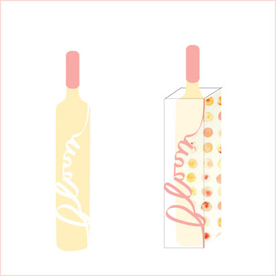
It has been a week since I started making the package. My initial idea was using a linen to cover the bottom, but I couldn't find the light color.... so I've been trying some other ideas. Today, I fianally came up with this one.
I hang the information cards from the top. I hope that I can finish up everything and update better image by tomorrow night.

I hang the information cards from the top. I hope that I can finish up everything and update better image by tomorrow night.
11/10/2007
solid color version
11/05/2007
11/04/2007
11/03/2007
on the top


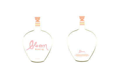
I found the door knobs to decorate the top of the bottle at anthropologie. http://www.anthropologie.com/anthro/index.jsp
It could be too much. Also, I changded my wine bottle. I use to have a super skinny bottle, but I changed it to the new bottle which shows the concept of "blooming" more than the old one.. Any thought?
Jaq Chartier
Thank you, Stan. I finally looked up Jaq's website and was very impressed by his works. Yes, his style is similar to what I did with water color the other day. (His creativity is way more sophisticated than mine though....) Anyway, now, he became one of my favorite painters. Thanks, again.
For anyone who is interested in his works, here is his website address! Jaq Chartier web http://www.jaqbox.com/


For anyone who is interested in his works, here is his website address! Jaq Chartier web http://www.jaqbox.com/


10/31/2007
new label
10/29/2007
10/28/2007
10/22/2007
10/21/2007
more sketch
logo sketch

I am having a hard time to figure out how I can approach this project. Should I start from logo? package design? bottle research?..........
Anyway, I started with logo. I prefer the top one because it is more pop, and cute looking. But is it too cute for wine...? Wine label can't be too cute? Lots of things that I have to concern about.
10/19/2007
sketch for bottle
In 2D class
10/17/2007
sketching for BLOOM
I decided to redesign the wine called " Bloom".
This morning, I bought some water colors and started skecthing.
Here is the pattern that I made. My theme of this pattern is "BLOOM", of course:)
I'm happy how it came out.. I like the fact that each circle has characteristics!!
It's fun to play with water colors once in a while. I love drawing and painting because I feel relaxing when I'm doing it.
I don't know that I am going to use this for my wine project, maybe for a package..? I 'll think about it this weekend.
This morning, I bought some water colors and started skecthing.
Here is the pattern that I made. My theme of this pattern is "BLOOM", of course:)

I'm happy how it came out.. I like the fact that each circle has characteristics!!
It's fun to play with water colors once in a while. I love drawing and painting because I feel relaxing when I'm doing it.
I don't know that I am going to use this for my wine project, maybe for a package..? I 'll think about it this weekend.
10/13/2007
poor design wine bottle
I went to the liqure store and chose these five POOR design wine bottles. Some of them like dog house and matua is okay, but others are not so attractive.
1. Dog house
This wine is a typical casual wine for younger generations. I like the name of this wine which gives me inspiration for new ideas.
2. Gekkeikan
This is a Japanese sake. I've seen this design for 20 years. I think it is the time for a new look.
3. Bloom
Same as dog house, I love the name of the wine, but I am not sure about the unprofessional illustration on the label.
4. Matua
This is a newzealand wine. I have to say that I am not a big fun of the logo..... I like the bottle color (green) though.

5. Yago
.......what happen to this bottle.... I think this is an eye-catching package but not in a good way.... I thought this was a juice. Sorry to say, but I hate the typeface in here.

I will bring these on Monday with better discriptions.
I have to taste these tonight!
1. Dog house
This wine is a typical casual wine for younger generations. I like the name of this wine which gives me inspiration for new ideas.

2. Gekkeikan
This is a Japanese sake. I've seen this design for 20 years. I think it is the time for a new look.

3. Bloom
Same as dog house, I love the name of the wine, but I am not sure about the unprofessional illustration on the label.

4. Matua
This is a newzealand wine. I have to say that I am not a big fun of the logo..... I like the bottle color (green) though.

5. Yago
.......what happen to this bottle.... I think this is an eye-catching package but not in a good way.... I thought this was a juice. Sorry to say, but I hate the typeface in here.

I will bring these on Monday with better discriptions.
I have to taste these tonight!
10/10/2007
good SAKE bottle reserch
I reserched Japanese sake bottles. Most of the sake bottles and labels' designs are classic and look similar to me. But I found three sake bottles which have modern design.
1. Designed by Tomo Narayoshi.

 Japanese call this Sake cup. You can get this size of sake at any stores in Japan. In here, Tomo Narayoshi's illustration made this common sake cute and special. You can use this as a glass after finish drinking sake. I like the box design which shapes a house.
2. Designed by Giorgetto Giugiaro

A italian designer, Giorgetto Giugiaro designed sake bottle with a little sake cup. Very elegant and modern.
3. Design of sake called "Yaoki"

I like the typography in here as well as the bottle design. Yaoki means "8 times up". It came from the saying "seven times down, eight times up". The interesting point is the bottle won't fall even if it is inclined at 45 degree.
1. Designed by Tomo Narayoshi.

 Japanese call this Sake cup. You can get this size of sake at any stores in Japan. In here, Tomo Narayoshi's illustration made this common sake cute and special. You can use this as a glass after finish drinking sake. I like the box design which shapes a house.
2. Designed by Giorgetto Giugiaro

A italian designer, Giorgetto Giugiaro designed sake bottle with a little sake cup. Very elegant and modern.
3. Design of sake called "Yaoki"

I like the typography in here as well as the bottle design. Yaoki means "8 times up". It came from the saying "seven times down, eight times up". The interesting point is the bottle won't fall even if it is inclined at 45 degree.
Back to the basic
10/08/2007
test2
10/07/2007
different image
Hawaii and Alaska
test
10/03/2007
Subscribe to:
Comments (Atom)


